Engage Comms is 10 years old and to mark the anniversary we wanted to make sure we are practicing what we preach as a strategic B2B marketing comms consultancy. So, we took the opportunity to do a full review of our own brand and online presence to audit whether we were still being authentic and clear with our proposition as it is in 2022.
While we have developed and reviewed what we do and what we say on a regular basis since we launched back in 2012, our logo and overall brand identity in terms of look and feel has remained the same. There is of course nothing wrong with this and we’re proud of the fact it’s stood the test of time, but we felt that it wasn’t reflecting the more ‘grown up’ approach and level of work we are now doing with national clients across the UK. We didn’t want to completely abandon all of what we had originally created as we would lose the brand equity and recognition that we had built up, but we wanted an update that to reflect who/what we have become.
Briefing the designers
Briefing designers is a key part of our role when working with clients as a full-service integrated agency that project manages a network of partners but, when it comes to our own brand, we are the client and that makes things a lot harder for us. It was really refreshing to step into our clients’ shoes and understand why they are so protective over their existing branding and what a big step it is to leave it in someone else’s hands. But we tried our best to give the designers the freedom to come up with something completely new that we wouldn’t have thought of, and we remained as open-minded as we could on receiving the first set of designs.
When briefing in a new visual brand identity, remember that the designers are the experts when it comes to colour palettes, fonts etc. What they need from the business owners is an insight into what you stand for, what your proposition is, and who you are trying to reach with what key messages. All of this should be established and articulated before you think about a re-brand but it’s often the other way round. Your new look and feel will only be authentic and fit for purpose if it’s based on who/what you really are. It’s so much more than what a logo looks like!
Choosing the imagery
Choosing a suite of imagery for your new website and other marketing materials and online brand assets can be a real challenge for services businesses with no tangible ‘products’. As they say, a picture paints a thousand words, and images are a key part of how audiences interact with and understand your brand, especially online. Stock photos or animated graphics that are used by lots of others in your marketplace are tempting but don’t help to bring out your unique identity and aren’t very authentic.
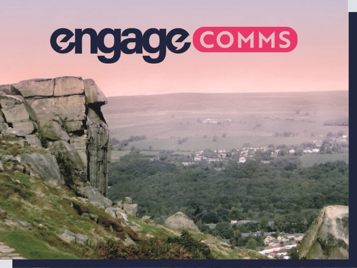
Since our home county of Yorkshire is a big part of our brand identity (it’s even part of our company values and guides our straight-talking, down-to-earth approach), we thought it would be good to use local landscapes. However, we still wanted to come across as having a national reach, especially post-Covid when physical location has become less important. We chose the image of the iconic cow & calf rocks in Ilkley, West Yorkshire, not far from our office, to bring to life our new strapline of ‘complexity clarified’. The larger of the two rocks depicts how we raise our clients’ profiles and make things clearer for their audiences. As a nationally recognised landmark it’s a subtle nod to our roots but has a deeper meaning than just where we’re based.
It was also really important to have photos of our Founding Directors on the new website (as cringey as choosing pictures of ourselves that we’re happy to share with the world is!) as our business is all about our personal relationships and expertise.
Making it digital-friendly
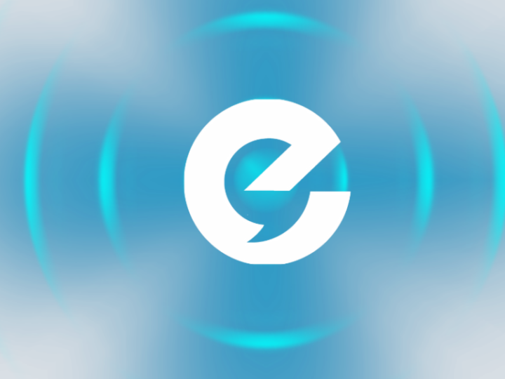
When we are asked to implement a new digital marketing strategy for clients, we often have to work with visuals that aren’t digital-friendly. While their website may be fully responsive, their logo may not work in social media avatars or on different graphics and backgrounds. That’s why we were so keen to retain the ‘e’ icon in our logo that we use for all our social profiles and has become recognisable as Engage Comms even without the rest of the logo.
We also needed to ensure that everything from the colour palette to the fonts and imagery could be used to create graphics that would stand out in social news feeds. Even printed marketing collateral and display materials for events need to be digital-friendly nowadays (remember how quickly we had to ‘go virtual’ during lockdown) so a digital-first approach to your brand identity is key, whether you mostly operate online or off.
We’re really pleased with the outcome of our new branding and website and feel that it does exactly what we intended in terms of giving us a new lease of life and communicating our experience, expertise, and unique selling points to those who aren’t already working with us. While we intend to keep evolving and developing, we hope it’s another ten years before we need another overhaul so that we can maximise the return on investment in terms of both cost and time. If you’re planning a re-brand and/or new website, it’s worthwhile putting in the extra effort to do it properly, taking the time to develop a robust brand communications strategy first. That way, the design process will be much smoother and the results much better.
Let us know what you think of our new brand (see the evolution below) and website and get in touch if you want us to help you do the same!